Category Archives: Graphs and statistics

It’s getting hotter!
No, this isn’t a climate change post, although it would have been a perfectly fine headline for one. The Earth as a whole is getting hotter and people aren’t going to do enough to slow that down. But this post is about me moving to places that would have been hotter than where I moved from even if we weren’t on our way to massive ecological disasters.
In 2017 I moved from Oslo, Norway, to Boston, Massachusetts. That’s across the Atlantic, yes, but it is also almost 18° of latitude south. Since Oslo is at 60° N, that is almost a third of those latitudes closer to the equator. Norway is warmed by the gulf stream though, and Boston isn’t, so the differences aren’t too harsh. It’s almost more noticeable that it gets dark at night in summer. Almost.
Here’s a plot comparing Oslo and Boston temperatures by month with data from Wikipedia:

As you can see (unless you’re listening to this in a text-reader, in which case keep listening) there is a lot of overlap in the max-min range per month. Oslo’s max and mean temps are consistently below, and except for January so is the min temp. The overlap is the greatest for January through May, but at that point Oslo’s average daily maximum drops below Boston’s mean and for July – December Oslo’s average daily mean temperature is below Boston’s average minimum. Oslo is definitely colder, but contrary to what many expect, it’s not because of cold winters. It’s because Boston is too hot in summer.
In an ideal world I would have next moved to somewhere that split the difference between Oslo and Boston, but since I’m at the whim of my wife’s academic career, I now live in North Carolina. North Carolina does not split the difference between Oslo and Boston, instead it is even further south and even hotter. How hot? Well …
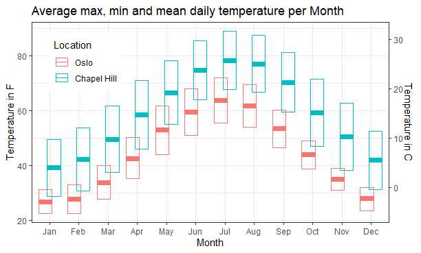
I live in Carrboro, a town that would be Chapel Hill if the US didn’t have hyperregressive local self-determination over local administrative boundaries. It’s another 7° latitude further south. If it had been 12° it would have been at 30° N and there would have been a beautiful geometric symmetry with Oslo’s 60°, but it isn’t, so there isn’t. Anyhow; Chapel Hill has temperature data on Wikipedia, Carrboro does not. But since the two are practically the same thing, here’s a plot comparing Boston and Chapel Hill:

Now North Carolina does get gulf stream effects, at least along the coast, but I have no idea if that matters for Chapel Hill. What we see here though is that there are some similarities to the Oslo-Boston comparison. … In that Chapel Hill is hotter than Boston. It’s mostly not like the Oslo Boston comparison though. In no month is the overlap as large, the differences are the biggest in January and February and even when there is a significant overlap the average daily temperature in Chapel hill is higher, or at least close to, the average daily high in Boston.
Currently it is April, but if I hadn’t been told already these graphs would have thoroughly convinced me that as hot as I found Boston, Chapel Hill is much hotter. … Yay …
Let’s round this off with the straight Oslo-Chapel Hill comparison so you can see how much hotter it is:
In May, Jun and July a hot day in Oslo is a well below average day in Chapel Hill, and for the rest of the year a warm day in Oslo is a cold day in Chapel Hill. And if you’re a delicate arctic flower like me, you should avoid June through August. It looks like a lot of days will be bearable, but on the other days I will sing praise to the refrigerating heat pump!
The plots in this post were created in R using ggplot. The code is available here: https://github.com/btuftin/Assorted/tree/master/Climate%20comparison
En myte om kongehusets legitimitet
Et vanlig argument fra landets kose-rojalister, når det ikke holder med at de kongelige jo er så fine, er at kongedømmet jo ble demokratisk innført. Og for de fleste så er vel det noe de vagt husker. Nesten enstemmighet i 1905 for selvstendighet og stort flertall for kongedømme. Det er bare det at det ikke stemmer. Det var aldri noen avstemming som satte kongedømmet opp mot noen annen statsform og den avstemmingen som faktisk ble avholdt inviterte på ingen måte velgerne til å følge sine prinsipper.
“Den norske kongefamilien fikk sitt mandat i en folkeavstemming der statsform ikke var tema, der en sikkerhetspolitisk garanti lå i potten og der regjeringen truet med å gå av om den ikke fikk det ja-svaret den ba om.”
Kjetil Bragli Alstadheim Republikken Norge
Avstemmingen (der 20 % av de som stemte var mot) var ikke et valg av republikk vs. kongedømme. Det var “Støtt regjeringen i å spørre prins Carl for å raskt få stabilitet og for å få gode forbindelser og støtte fra England” vs. “Vet da faen, men noen må vel ta ansvar hvis dere trosser oss og vi tar våre hatter og går.”
Ikke at det betyr så veldig mye hva folk valgte og hvorfor i 1905 for noe som er et prinsippspørsmål og burde løses som ett i 2014, men det er jo greit å ha argumentene i bakhånd om man skulle diskutere med de prinsippløse.
Picture humanity
The image below, unless you have some sort of resizing of your screen or browser, represents one fifth of the current world population as 400 x 350 pixels. That means each pixel, each of the smallest dots in the image, the width of the black edge, the single black dot in the middle of the pale blue square in the upper left, is 10000 individual human beings. If you’re not a hive mind, an alien intelligence or a terrestrial species capable of reading blogs that’s not Homo sap. (if you are, please leave a comment), that makes you one ten thousandth of a pixel in this image of just one fifth of humanity today.

The pale blue square, mainly there to make it possible to find that single, 10000-person dot, is about the population of Norway, 5 million people. The smaller black square next to it is how many people are born on this planet, each day, about 37000. And the smaller dark blue square next to that again is how many die, about 16000.
What about the big pink area? That’s the population of China. Nearly a fifth of humanity all by themselves. India would fill up nearly as much, while Europe and the US together nearly get to play in the same league.
What this means is you’re a miniscule part of humanity. Your desires, hopes and fears may be the most important thing in the world to you, but you’re only one of 7 thousand million people that make up humanity. All your actions are, most likely, swamped by the actions of the rest of us, and if there was a vote between pleasing you, and pleasing everyone else, you’d lose.
On the other hand, so would everyone else. The doings of humanity are made up of the actions of every individual. And as you’re reading this, you’re likely to be one of the part of humanity with the most freedom to act, the largest share of humanity’s surplus, the biggest influence. Thus, by any reasonable system of ethics, you also have the most responsibility to consider the consequences of your actions.
