My favorite podcasts
My wife is off on an adventure this weekend and I’m alone with a dog who is being a pest, so it’s time to write about my favorite podcasts, which I’ve meant to do for some time, but didn’t get around to. My podcast listening has two phases. There’s the “only in the car with my wife” phase, which started when we were not yet married but driving somewhere together, and there’s the “every day when I walk the dog, because otherwise that activity leaves me alone with my brain for too long” phase, which started when we, somewhat to my surprise, got a puppy, and my wife then got a serious ankle injury leaving me as the sole dog walker for months. The top casts from the first phase are the McElroy brothers surreal “advice show” My Brother, My Brother and Me, usually referred to as MBMBaM (pronounced /məˈbɪmbæm/), and their series of podcasts playing role playing games with their dad, called The Adventure Zone. The McElroy’s are podcasting superstars, so they don’t need me to hype them (but if you’ve never listened, give it a shot), so I’ll instead go through those from the second phase, which are all RPG podcasts I sought out when walking the dog so, so, so much caused me to burn through the McElroy RPG backlog. I’m doing these in order of discovery, because that’s what I want to do.
The Eternity Archives
The Eternity Archives has unfortunately just announced they are wrapping up and then going into hibernation, but they were a great RPG showcasing podcast centered on the aforementioned Archives. Our main cast of three bold archivists from an extradimensional Archive would be sent off to a new universe on missions from the Archive, often to retrieve an item not belonging in the universe. The adventure, each using a different RPG system, was book-ended by the players discussing the system. Some general rules and first impressions before the adventure, and their opinions and experiences after. They had several fun guest stars, amusing and developing Archive lore and I’m going to miss them. Fortunately they were kind enough to give me some suggestions when I asked what other RPG podcasts they recommended which led me to.
Dangerous Times at Chillhaven High
Chillhaven might be my absolute favorite among these. I know, I did go with chronological order to avoid playing favorites, but Chillhaven is just so fun. A primarily Monster of the Week podcast set in the small town of Chillhaven, it follows teenagers Angela, Penny and Zeke as they become Chillhaven’s primary defense against the zany attacks the keeper comes up with.
The show has great audio, wonderful, original score, spectacular lore and lovable PCs and NPCs. Just don’t listen if you are squeamish. It is definitely a horror RPG, even if it is funny as hell. I’m not a fan of horror in general, but love this humorous audio take on … no details. Don’t want to spoil.
Bad Heroes
Bad Heroes is a Pathfinder 2 based fantasy podcast set in a world full of your more or less standard fantasy creatures. The setting is a delightful homebrew world centered on the Unholy Empire ruled by Queen Sephira from the capital of Vyer. Not satisfied with her dynasty’s long alliance with hell Queen Sephira has … “recruited” the cast to help obtain individuals suffering from powerful curses like vampirism, lycantrophy and … they haven’t been sent after a third curse yet. I’m dying to know.
The motley crew of … not exactly misfits and ne’erdowells, but not exactly not that either, have to find a way to work together and succeed against overwhelming odds in missions that might be in service of something terrible, unless they can discover what it is and stop it if it’s bad. GM and players work together to produce a rich world you want to learn more about along with the characters.
Sword of Symphonies
Sword of Symphonies is different. It’s intended to be different. It’s a different system. Yes, it is. The Heroic Chord system is the brainchild of Host King Cat, an author, editor and game designer from Edmonton. They’ve designed a system that is deliberately different from and more cooperation based than most, and are joined by friends Kersten, Nick and Kathleen, playing, most of the time, Penelope, Cobb and Tissa to showcase the game, still under development, through adventures on the post cataclysmic fantasy world of Amylta, where every hero has some magic and the enemies are most often Horrors, spirits of humanities worst excesses still repeating trauma from before the cataclysm, and Noble Demons, beings of superhuman powers and obsessions, who are best left alone and not directly combated if an encounter is unavoidable. That was a very long sentence, but in the spirit of this podcast I shall not apologize.
Shrimp and Crits
I started running a bit low on episodes of some of the show and needed to add to the rotation. Asking the Bad Heroes discord for tips led me to Shrimp and Crits. Another Monster of the Week podcast Shrimp and Crits is set in the Florida panhandle in the fictional town of Gullacochica. Reptile retreat owner and part time cryptid Raymon “Ray Ray” Lareaux, fresh faced Deputy Sara Payne of the GPD, and agent Ari Green of whatever the FAE is, must work together to save Gullacochica from what Sheriff Donnie Terrance prefers to call “Shark attack”s and leave well enough alone.
I’m going out on a limb here, having only seen one episode of X-files, but this is what if Mulder worked for a supernatural agency, Scully was a deputy and there was a third main character who has to be careful not to get drenched in water. I’m not sure they have what it takes to save Gullacochica, or the rest of Flordia, from what is coming, but I thoroughly enjoy finding out.
Not Another D&D podcast
Okay, so chronologically NADDpod belongs earlier, but it’s another juggernaut in the RPG podcasting world so it’s going down here. If you like D&D type podcasts, and get past the deep dive into dragon genitals, by which I mean an overly detailed discussion, not a literal dive, though I wouldn’t quite put it past them, do give this one a go. Everyone has so much experience in comedy, improv and RPG that it is a joke a minute from the first to the last.
We don’t have to do anything about climate change
I mean that in the sense that we don’t have to do anything. I don’t have to write this text and share it, but I’m doing so because the thoughts in it keep bugging me and I have a vain hope they’ll do so less if I write them down and share them.
I keep running into problems though. It is such a very large problem, intertwined with all the moral and ethical quandaries of global human civilization and I’m incapable of not getting bogged down in detail. So here’s my third try of the month. This time in bullet points and less self-criticism:
- The Climate Crisis is very real and has barely started. If the Earth was a car and average temperature the speed, we’d not even be at the point where we’re letting of on the gas, and we’re not sure what the top speed is for where the pedal is now. After 30 years of warnings being watered down by political influence and scientific traditions of caution with uncertain but dire prediction, scientists are speaking up more. Global heating is accelerating, warns scientist who sounded climate alarm in the 80s (The Guardian Nov 2 2023)
- The consequences will be civilization shattering. It is only a question of when. We got a taste of how sensitive supply lines in modern society are to interruptions during the pandemic. Now imagine what will happen when weather gets more extreme, less stable and crop failures more frequent. At some point multiple essential crops will fail at the same time and we will have have global famines and runaway food prices making the current inflation pains pale in comparison. Prices of some basic European foodstuffs keep skyrocketing (ABC news Nov 2 2023)
- Blaming “oil companies” is easy, but they wouldn’t exist if we didn’t buy the products, and the people working in and for them are mostly just making the same decisions we all make to not sacrifice in ways that would affect themselves greatly and the world just diffusely. Oil companies and their employees are replaceable parts in a system that can only change by changes in demand and by changes in policy.
- The issues of the climate crisis are deeply intertwined with global inequality, and our inability to deal with that will have its own consequences for international trade and cooperation. Action to protect against climate crisis ‘woefully inadequate’, UN warns (The Guardian Nov 2 2023)
- Our individual impact is profoundly underexplored, and there are no simple answers to what individuals should and shouldn’t do. Someone living in a place without public transport can’t just give up their car. Someone without great options can’t just quit working for a problematic company. Someone flying a private jet is a much larger burden than an upper middle class average person, but there are many more upper middle class average people, so Elon Musk might be among the worst people alive, but that doesn’t mean your contribution is meaningless. (Elon Musk’s private jet emitted 132 times as much carbon as the average American does in an entire year)
- So here’s my personal list of changes I’ve made:
- I’ve shifted from “My wife is vegetarian, but I eat meat occasionally” to “I’d rather not buy meat at all”. Poultry and pork rivals some alternative protein sources when measured on protein alone in some studies and some practices in non-meat agriculture are destroying ecosystems, but it is hard to get around the fact that it requires approximately 10x the resources to produce vegetables as it takes producing meat, since 90% goes to running the cow until slaughtering time. So until meat is all produced with grass from marginal pasture unfit for growing human food crops, I’m off the meat. Food and Climate Change: Healthy diets for a healthier planet (UN website )
- I don’t fly. Living in the US, and living in the US as a Norwegian, this suuuucks. But long distance travel is extremely carbon intensive. A solo road trip of the same length isn’t great either, but for most people those are rarer. If you are an average American, a single transatlantic round trip adds 10% to your carbon emissions for the year, and except for micronations and petro-states, “average American” is the worst carbon emission average in the world.
- I try not to buy new things or replace things that aren’t fundamentally broken. Fashion, home renovation and upgrading appliances that aren’t broken is a large part of our climate impact.
- I only have one car. It’s a hybrid. I commute by bike or bus when possible, but much of the US is terrible for doing day to day activities without a car. It wouldn’t be impossible, but I too have a limit. Buying an electric car wouldn’t make sense. I don’t drive much, electric car production has a higher initial carbon footprint, and I’d be using electricity in an energy ecosystem that is not producing enough green energy.
- If you believe sacrificing something for the sake of future generations is a good thing, please do so. It’s hard to convince the average human that disaster is looming when those doing the talking aren’t acting like disaster is looming. (I’m looking at you, Al Gore, with your multiple huge homes. Putting in green technology is great, but putting green technology in a smaller house would be so much better.)
- If you don’t believe sacrificing something for the sake of future generations is a good thing I envy you. I’d rather you weren’t just one among a large proportion of humanity, but it must be nice to think “per capita” is a satanic trick and not basic sensible statistics.
- If you do, but aren’t, please reconsider. There is hope, but it requires a ground swell of willingness to reduce, reuse, recycle, instead of the political backlash to reality based policy we are currently seeing.
Thank you for reading.
Was (a short story)
I don’t know why I went. I knew it would be depressing. Maybe it was the same tendency towards self-torture which has kept me striving towards green behavior despite the belief it’s futile, even past having been proven right. Whatever it was, now I was there. The Zoo’s Hall of Climate Change, soon to be no more, though the announcements only mentioned that obliquely.
Maybe that’s why I went. Because I noticed to footnote in the grand announcement of the new Hall of Conservation Efforts and thought I might be one of the few noticing or caring. “*the Hall of Conservation Efforts will replace the Hall of Climate Change.”
I hadn’t been there before. I’d found zoos a bit depressing even before they became a small band aid on the massive wound of human influenced extinction. But this total lack of “last chance to see” promotion that usually accompany changes in visitor based endavors made me want to go. I could see why “see it before it is gone” wasn’t happening for this exhibit though. It was not a good exhibit and replacing it was obviously just the last step in a process of not including off putting information about the rapid degradation of most known ecosystem, so “see it before it is gone” would have gone contrary to that whole endeavor.
It mainly consisted of sequences of plaques showing animal habitats and ranges shrinking. The World’s rainforests, almost gone, Arctic sea ice, no longer consistent enough to sustain the species that depended on it, or no longer part of their range after the collapse of the Arctic Ocean food chains. The speed of destruction readable in how many or few different plaques existed.
The plaques I’d seen on my way here to the hinterlands of the gardens no longer showed maps, or spoke of threats. If they mentioned a species status at all it was only in relation to the efforts to improve it, and even then it never mentioned specifics. “The Zoo’s breeding program is in important step in maintaining and increasing the number of Jaguars.” Yes. Very good. How many are there though? I tried looking it up, but it was impossible to find anything other than the number in conservation programs. I’m sure there is still someone monitoring them in the wild, but if they publish their information online they are drowned out by all the businesses touting their contributions to keeping the 75 in captivity alive and scammers and scrapers posting “AI” generated pages full of scammy ads about popular topics.
I searched for old jaguar plaques in the Hall of Climate Change and did not find any. I’m not sure why. Perhaps the jaguar program is new, or perhaps it’s that I was not searching very carefully. Every sequence of plaques was a depressing tale of progressive habit destruction and the journey from Threatened to Near Extinct, and when I reached one on the failure of the Paris Agreement, apparently created on its 25th anniversary, I skipped a whole section out of self preservation.
Instead I was drawn in by a series of small plaques describing the shrinking numbers of Rio Grande Silvery Minnows, and the shrinking Rio Grande. The last one began “The Rio Grande was a river in the southwestern United States and Northern Mexico”. It reminded me of the first time reading the word “was” about large biotopes.
That was in regard to the Aral Sea. Once it was the fourth largest large in the world. When I was a child it was still a clear feature of a map of the entire world, then all of a sudden it wasn’t. It was a shock to me, though I learned that it had been shrinking since the 1960s. Like with the Rio Grande its waters diverted to agriculture to such an extent that it baffles the mind. From 68 thousand square kilometers to a tenth of that. And this only because by a quirk of geography a northern part could be revived with a dam.
To me that was an inspiration, but also portended doom. Knowing that something this prominent could go from “is the fourth largest lake in the world” to “was a lake” made me fervent about doing what I could. Knowing that people knew about this for decades and let it happen made me despair that any human society was capable of dealing with such challenges.
For the people weighing rescuing the Aral sea the disaster lay in the future and would happen to other people. The costs, both in money, time and loss of production, lay in the presence. The benefits were concrete, the consequences diffuse. Still in my mind I yelled at them, “Why didn’t you do something?!”
In the Hall of Climate Change though my mental shout echoed back to me from every wall and I turned around and left. I left the Hall of Climate Change, soon to be a self congratulatory hall of Conservation efforts sponsored by one multinational or the other. I left the carefully crafted mini-habitats, that, for some species, is the last home they have on this planet. I make a donation on my way out for the zoo’s conservation efforts, despite knowing that they’ll be presented without any context about why they are needed.
I got on a bus at the edge of the huge parking lot. As we pulled out of the bus stop two small children small enough to stand side by side on a bus seat turned around and stared at me for one of the many possible reasons small children have for doing anything. It likely wasn’t to accuse me of not doing anything about the destruction of jaguar habitat, but the “Why didn’t you do something?” was still echoing in my mind. These children would never experience the Aral Sea, or the Rio Grande, or the Amazon rainforest being the geography of the present. They were all in the past to them. But whether they will notice when what is now slips into was then or not, that process will go on. Then I’ll just be one of the faceless crowd of humans past who didn’t “do something”. And as one of them I failed. As one of them I didn’t do enough.
Attorney General who avoided prosecution for deadly hit and run investigates State Governor for corruption as she’s dismissing she’s having an affair with advisor shared with Trump until kicked off Trump team for groping donor
The Washington Post has something for everyone today with articles like Senate set to approve funding bill hours before deadline to avert shutdown, Cryptocurrency program has made Miami $7 million so far; mayor suggests it could replace taxes, As W.Va.’s governor leans on vaccination sweepstakes named after his dog, not enough are getting the shot and 96-year-old former Nazi camp secretary facing trial arrested after fleeing from nursing home. But none of those beat the article with dueling headlines Corey Lewandowski pushed out of Trump team amid groping allegation and South Dakota Gov. Kristi Noem dismisses conservative website’s claims of extramarital affair with former Trump adviser, which has all of the stuff in this post title. Well almost.
Today’s article, probably wisely, chooses not to bring up the South Dakota’s AG’s hit and run in September 2020. While driving home from a fundraiser the AG hit … something. He called it in to 911 as “maybe a deer” and then drove home. The next day he returned to the crash site and found the man he had killed. As details of the investigation came out, such as the victim impacting the windshield with such force parts of his glasses ended up in the back seat, the Governor and others put pressure on the AG to resign. He refused, claiming he had done nothing wrong and prosecutors gave him a plea deal where he admitted to an illegal lane change and using a phone while driving (the latter some time before the accident). He received to $500 fines at a hearing he didn’t attend in person.
He’s still likely to keep his job, but in the mean time he is investigating Governor Kristi Noem for corruption. Kristi Noem has been positioning herself for a potential run for president by taking a FREEDUMB approach to Covid, which lead to sparsly populated South Dakota, little impacted in the first wave of Covid, rocketing to one of the worst states in a massive wave at the end of last year. (They are currently the 12th worst state for per capita COVID deaths.) But she also took the time to arrange a meeting about “appraiser certification procedures” with her daughter, who had failed to secure a certification as a real estate appraiser, and public officials responsible for that process. Her daughter later received the certification and one of the public officials was pushed to retire. The official then made a formal complaint for age discrimination and settled with the state for $200k.
It’s not the only trouble Noem appears to be in though. Eager to pull in Trump voters in the next presidental election Noem has been doing political events across the country, traveling with Trump’s first of many campaign managers and, at least up until today, part of the inner Trump circle, Corey Lewandowski. A conservative website claims to have learned from multiple sources that the two Trump-suck-ups are having an affair, which wouldn’t be the first one Lewandowski had with Trump co-workers. Noem of course denies the allegation.
But wait! There’s more!
While Noem is tweeting her innocence, Lewandowski is keeping mum, while his attorney stated: “Accusations and rumors appear to be morphing by the minute and we will not dignify them with a further response.” The plural here refers to Lewandowski also being accused by Trump donors John and Trashelle Odom of harassing, stalking and groping Trashelle at a charity event. And while Lewandowski isn’t dignifying the accusations with a response, Trump’s director of communications tweeted that Lewandowski is “no longer associated with the Trump World.”
And now you too know all this. I’m sorry.

It’s getting hotter!
No, this isn’t a climate change post, although it would have been a perfectly fine headline for one. The Earth as a whole is getting hotter and people aren’t going to do enough to slow that down. But this post is about me moving to places that would have been hotter than where I moved from even if we weren’t on our way to massive ecological disasters.
In 2017 I moved from Oslo, Norway, to Boston, Massachusetts. That’s across the Atlantic, yes, but it is also almost 18° of latitude south. Since Oslo is at 60° N, that is almost a third of those latitudes closer to the equator. Norway is warmed by the gulf stream though, and Boston isn’t, so the differences aren’t too harsh. It’s almost more noticeable that it gets dark at night in summer. Almost.
Here’s a plot comparing Oslo and Boston temperatures by month with data from Wikipedia:

As you can see (unless you’re listening to this in a text-reader, in which case keep listening) there is a lot of overlap in the max-min range per month. Oslo’s max and mean temps are consistently below, and except for January so is the min temp. The overlap is the greatest for January through May, but at that point Oslo’s average daily maximum drops below Boston’s mean and for July – December Oslo’s average daily mean temperature is below Boston’s average minimum. Oslo is definitely colder, but contrary to what many expect, it’s not because of cold winters. It’s because Boston is too hot in summer.
In an ideal world I would have next moved to somewhere that split the difference between Oslo and Boston, but since I’m at the whim of my wife’s academic career, I now live in North Carolina. North Carolina does not split the difference between Oslo and Boston, instead it is even further south and even hotter. How hot? Well …
I live in Carrboro, a town that would be Chapel Hill if the US didn’t have hyperregressive local self-determination over local administrative boundaries. It’s another 7° latitude further south. If it had been 12° it would have been at 30° N and there would have been a beautiful geometric symmetry with Oslo’s 60°, but it isn’t, so there isn’t. Anyhow; Chapel Hill has temperature data on Wikipedia, Carrboro does not. But since the two are practically the same thing, here’s a plot comparing Boston and Chapel Hill:

Now North Carolina does get gulf stream effects, at least along the coast, but I have no idea if that matters for Chapel Hill. What we see here though is that there are some similarities to the Oslo-Boston comparison. … In that Chapel Hill is hotter than Boston. It’s mostly not like the Oslo Boston comparison though. In no month is the overlap as large, the differences are the biggest in January and February and even when there is a significant overlap the average daily temperature in Chapel hill is higher, or at least close to, the average daily high in Boston.
Currently it is April, but if I hadn’t been told already these graphs would have thoroughly convinced me that as hot as I found Boston, Chapel Hill is much hotter. … Yay …
Let’s round this off with the straight Oslo-Chapel Hill comparison so you can see how much hotter it is:

In May, Jun and July a hot day in Oslo is a well below average day in Chapel Hill, and for the rest of the year a warm day in Oslo is a cold day in Chapel Hill. And if you’re a delicate arctic flower like me, you should avoid June through August. It looks like a lot of days will be bearable, but on the other days I will sing praise to the refrigerating heat pump!
The plots in this post were created in R using ggplot. The code is available here: https://github.com/btuftin/Assorted/tree/master/Climate%20comparison
Fox News still exists
Donald Trump has just been defeated. This is undoubtedly good news. A second term would have been terrible both in policy outcomes and in psychological effect on both his fans and detractors. But once everyone is done waving actual American flags and shooting off fireworks and we start waiting for the electoral college to make Biden and Harris officially official president-elect and vice-president-elect there are important realities to acknowledge.
For one thing the blue wave was rather disappointing. Now there is some room for it to get more impressive as remaining races shift, but even with the motivation of the pandemic there was no massive repudiation of Trump and Trumpism, and unless the democrats can come from (slightly) behind and win two run-off elections in Georgia in January, the republicans will still have a majority in the Senate and while Collins et. al. will be deeply concerned with Mitch McConnell’s choices, they will vote down important Biden legislation anyway.
In two years it will be midterms though, and things could change. With Trump, hopefully, a fading memory by then, in the long run, a bigger issue is that Fox News still exists. In four years of being the worst president in the history of the US Donald Trump never fell below 36% approval in 538’s aggregate of polls, and for the last two years he stayed above 40% among likely voters, much thanks to right wing media functioning as a de facto propaganda machine for the administration.
While the Washington Post documented Trump making an average of 16.9 false Fox News, among others, worked hard to twist reality so that his lies would instead be either “actually the truth liberals don’t want to hear”, “hyperbole, everyone uses that” or “a joke, ha ha”. Similar approaches were applied to other types of Trump related scandals and when they couldn’t use any of those approaches they ignored the story completely and ran a story about pandas or something instead.
Now Fox News isn’t the only problem. Less biased mainstream media employs opinion writers and talking heads with just as twisted views on reality, and invite other contributors more twisted than that again in the interest of “balance”. And there’s Sinclair Media, which feeds similar crap to thousands of “local” TV stations. But Fox News stands out because of their size, it’s the most watched cable network and because of their symbiotic relationship with the GOP and, for most of the last four years, the president.
Fox News also show, in my opinion, that going forward anyone worried about Trumpism need to go all in on committing to make more lifestyle choices based on their politics, as well as engaging in political activism. Yes, it’s important to increase focus on local elections and support grass root movements such as those who helped turn Georgia blue this year, and might also get us a 51-50 senate with VP Harris breaking ties. But money and propaganda still plays an oversize role in US politics and even progressive politicians struggle with following through on changing that.
What has been shown to work though is voting with ones wallet. Relatively short lived campaigns have hurt Fox News and, at least temporarily, influenced their programming choices and the actions of advertisers. More concerted efforts, sustained over time, could do more. It is nice to think the next election cycle will make it possible to enact more progressive policies, but a lot of voters have short memories and a view of themselves as future millionaires and the people who are millionaires only too happy to funnel some of those millions into promoting politicians who have little to offer beyond “lower taxes!” But their millions are contingent on everyone continuing to buy their goods and services, and redirecting our purchasing power where the least of it flows into promoting regressive politics has a proven track record.
It also has the potential of creating improved conditions for workers both domestically and abroad, even without new laws and regulations, as employers who exploit their employees are often the same who donate big to the rottenest politicians. So it’s really win-win, but it requires everyone to pay attention, even when it’s not an election year, and even as “What the fuck the the president do today?” goes back to being a rare event.
A naive (or corrupt) judge may have ruled that no reasonable viewer takes what Tucker Carlson spews is factual, but would take losing a lot more revenue for Fox News to stop broadcasting him to his obviously unreasonable audience. But even if they never do, boycotting Fox’s advertisers takes money out of pockets that donate to regressive politicians. Again, win-win.
Just remember that electing Biden was a battle won, but this isn’t a war. For one thing, few Trump voters are actual enemies, and unlike a war, in politics there is never a final cessation of hostility. But like in a war we could get far by strangling the supply lines.
“One daughter + family burnt up in Hinkley fire”
The headline is from the life story of my great-great grandfather’s sister Thora and is all she included about her aunt Olava. Most of Thora’s other aunts and uncles got short shrift, but this terse mention of something so dramatic still resonated with me.
When Thora’s parents immigrated to the US at age 13 with her and one brother, they followed in the footsteps of family members. Some had left Norway before Thora was born, including an uncle, an aunt and two brothers. The late-comers settled near some of their relatives, but others had already moved on and in those days not everyone just popped over to the next state (or Canada) to see their relatives. So when Thora wrote about her life decades later she gives a good account of her siblings, her parents and her grandparents, especially those that lived near by, but her recollection of her aunts and uncles is somewhat sketchy. When listing her paternal grandparents’ children two of the names are wrong and she rounds things off with:
There were more, but I did not know them. One daughter + family burnt up in Hinkley fire.
Thora Miller’s story
When I got round to research this there was one clear candidate for the fire victim, her aunt Olava. And “Hinkley fire” had to be The Great Hinckley Fire, a catastrophic forest fire in Minnesota in 1894. If Olava did die in this fire it would have been when Thora was three months old and still living in Norway, so it was understandable Thora would know little of her. But the fire burned to town of Hinckley to the ground, taking with it a lot of records, so it was still disappointing she didn’t happen to know a little more.
The Great Hinckley Fire
In the late 19th century Hinckley was a booming logging town in aptly named Pine County, Minnesota, with a population of over a thousand. Nearby communities brought the population of the region up into the low thousands, many of them Swedes and Norwegians. Logging was happening all around and whole areas were stripped of trees, leaving behind branches, bark and sawdust to dry as kindling in a hot and dry Minnesota summer.
Forest fires happened all the time in an age when open flame was still a much used tool for staying warm at night, cooking meals and getting rid of debris, even for people living in a dry forest. At the end of August 1894 fires had been burning for weeks not far outside Hinckley and neighboring hamlets, but even in the dry summer they had not posed much threat.
The biggest forest fire disaster in the US had killed over a 1000 in Peshtigo 20 years earlier, but had been somewhat forgotten as it happened on the same day as the Great Chicago Fire, which killed far fewer. But most forest fires moved slowly and burned themselves out. Even in a dry summer.
This all changed on Saturday September 1st when atmospheric conditions conspired to make a firestorm that swept through the towns and burned several hundred square kilometers in a few afternoon hours. The most detailed account I’ve seen of the aftermath is a booklet titled “Eld-cyklonen” (The fire cyclone), originally published in 1894 in Swedish, collecting horrifying stories from survivors, an opining on causes and irresponsible forestry practices. An English translation is available in pdf-form at the Minnesota Historical Society and a 1976 reprint of the translation is available on Amazon.
Many of the stories are truly horrifying and I’m not going to include them here, but the booklet is proof of both how much this was news in the day, and also about how sparse the sources are, as it’s not even certain who the author of this booklet was.
The fire completely destroyed Hinckley as well as six nearby settlements and the official count of the dead eventually rose to just over 400, not all of them identified and not including Native Americans and others living in the forest outside the registered settlements.
The following Monday edition of the New York Times reported the news thus:
HUNDREDS PERISH IN FOREST FIRES ———————————————————–
The New York Times, Monday September 3rd 1894
Western Towns Destroyed and Citizens Burned to
Death in Their Crumbling Houses
———————————————————–
TERRIBLE SCENES OF SUFFERING AT HINCKLEY
It goes on to list many of the dead, but both this list and updated ones later suffer one big problem for my purposes, they list all the adult women as “wife”.
Olava Knudsdatter
To determine with more certainty if Thora was right about her aunt and her family dying in the fire I needed to find out more about Olava’s family. If I had the name of her husband and children I could perhaps perhaps determine which of the “SURNAME, wife of X”, was her, if any.
I take my genealogy hobby seriously, so I was going to do that anyway, but with Norwegian women who emigrated on their own it is not always easy to find them in American sources. The lists of dead at Hinckley aren’t the only ones skipping wives’ names, and marriage is even better at wiping out recognizable surnames than the name changes that happened when Norwegian traditions already in flux encountered a society completely baffled by true patronymics.
So I started back in Norway. Olava was born February 15th 1858 in Ådal, Buskerud, Norway at a small tenant form called Odda (The Point) on the Ådal river. Her parents were Knut Torstensen, often called Odda, occasionally Tuftin, and Inger Torine Gulbrandsdatter, and she had five older siblings at the time of her birth.
The closest sibling in age to her was her brother Paul, two years older and one of the first in the family to emigrate in 1878. When Olava emigrates in 1881 her destination is given in Norwegian records as Bradhead, probably Brodhead in southern Wisconsin and presumably to meet her brother.
My search then lead to a marriage in 1883 in Wisconsin where the bride was an Olava Knudsen and luckily for me the record included the names of the parents, horribly transcribed as Kneed Thorstenson and Inge Guth.
Still this match to both parents’ names established that this was highly likely to be the right Olava Knudson. So now I knew that she married Lars A. Wold, son of Anders Wold and Kari Larson on April 11 1883. This then got me three records for children born in Chippewa Falls, Wisconsin. Alfred, born in May of 1884, Ida born in June of 1886 and Christian born in February 1890. For all of these the father is listed with the anglicized name of Louis Wold or similar.
With the whole family known I could go back to the lists of dead. The most complete ones are transcribed from “Memorials of the Minnesota Forest Fires in The Year 1894” and include Louis Wold, age 44, who burned to death in the swamp one-half mile north of Hinckley a place where many victims had sought refuge in vain in wetter country. The record says he was identified by John Pearson and was buried in Hinckley.
Along with Louis are listed his family, presumed dead in the same location but not identified:
- Wold, Mrs. L. – age 35
- Wold, Alfred – age 12
- Wold, Ida – age 11
- Wold, Christ – age 6
- Wold, baby – age ca. 1
- Wold, Louis Sr. – age 72, father of Louis
Considering the names and ages were given by a neighbor the matches are too close to be a coincidence, so here we reach the end of the story. However terse and gruesome Thora’s note, it was absolutely correct, one aunt and her family had indeed died in Hinckley.
I find these “dead ends” in the family tree to be especially rewarding to research. Perhaps part of it is a perverse enjoyment of actually finishing something. All other genealogy research “just” leads to yet more cousins to keep track of. But mostly it is that these are stories that often get less attention as people build their family trees, focus on their ancestors and forget almost everything about that “one daughter + family [who] burnt up in Hinkley fire.“
A sort of PS
Some time later I found another reference to Hinckley in my research. Hans Kristian Thorstensen Langbråten, Olava’s nephew and Thora’s cousin, emigrated with his wife Kari in December 1893 with destination given as Hinckley. Presumably they were going to join his aunt, but luckily for them they were not living there 9 months later, or if they were they made it out alive. Christ Britton (as he started calling himself) and Carrie had at least 10 children, the first half dozen or so born in Duluth, but eventually they moved back to Pine country and the rebuilt settlement of Sandstone.
How many colors are there in the rainbow?
I’m currently (re)learning computer programming, and in trying to come up with a project for an application I started thinking about colors in general and computer colors in the specific. This post is going to be an unnecessarily long and detailed ramble about those topics.
My application
Let me first get the promotion out of the way. I spent a lot of time  writing this toy program, so I want to get as much mileage out of it as I can. You can always skip ahead if you just want to read about colors and I won’t bother you about applications and programming until towards the end.
Screenshot of my application.
ComputerRainbow lets you play with generating spectral colors with varying color resolution. The size of each color block is customizable, as is what color you are centered on if there isn’t room for all the colors in the image.
The gradient from “just a few colors” to “hundreds (or thousands) of colors” makes cool patterns. A windows installation file is available here. Or the source code can be downloaded from GitHub and you can run it on any computer you can install Python and PyQt5 on. PyQt5 is the GUI programming package I used. Unfortunately the sliders appear to be a bit wonky on OSX, but the program will still make pretty pictures.
Colors
“All the colors of the rainbow” is a common phrase, sometimes used as a flowery way of saying “all the colors”, which is not strictly true. The rainbow is also often used to teach children “the colors”, where “the colors” are perceived to be some inherently correct way to split up the rainbow, which is also strictly hogwash. It seems really true, because to some extent, naming the colors influences our perception of them.
Have a look at the rainbow in the ComputerRainbow screenshot above. Start at the bottom and pretend you are Isaac Newton doing a scientific analysis of the spectrum and your decision on how to split the spectrum up and which parts to give separate names will be considered gospel for centuries.
Now this generated spectrum isn’t perfect, but it should be fairly close to the real thing, so how many colors did you get? What would you call them? Would it be something like Red, Orange, Yellow, Green, Blue, Indigo, Violet? If so you are in good company. That’s where Newton landed after adding Orange and Indigo. In part because his vision wasn’t all that great, and in part because he really, really wanted there to be seven, closet mysticist that he was.
But if that’s what you ended up with, which name goes with which part? Or perhaps you didn’t go with ROYGBIV at all, so let me just get to the point. In modern English, and in other Germanic and Romance languages, the bright band above green, that Newton labelled “blue” would more likely be called cyan or light blue, and Newton’s “indigo” would be the “real” blue. And in his book on the amazing work he did discovering the nature of white light and colors (Opticks or, a Treatise of the Reflections, Refractions, Inflections, and Colours of Light) he shows only five subdivisions of the specter for most of the early chapters, until he starts drawing parallels between colors and musical notes and really needs seven.

Spectrum from “Memoirs of the life, writings and discoveries of Sir Isaac Newton” – published 1855 (Public domain)
Now if Newton had been Russian, he would likely have called the cyan “Голубой” (the color of the sky) and the blue “Синий” (the color of a cornflower). I say that because that is how the Wikipedia page on the Rainbow split it up in Russian. And in Russian those are distinct basic colors in much the same sense Blue and Green are in English. There is no “sky blue” in Russian, because the sky is Голубой. Other languages have other subdivision, often grouping blues and greens differently.
Diving much deeper than that requires an expertise I do not have and a willingness to take sides in an ancient battle between factions of linguists and anthropologists. But it is fair to say that ROYGBIV isn’t a scientific fact, it’s a cultural one.
Color vision
Okay, it’s partially a cultural one, but there is some biology involved. We have three main types of color sensing cells, often simplified to red, green and blue but more correctly called L, M and S (for long, medium and short wavelength-sensitivity).

Cone photo sensitivity. (Public domain image)
The “red” cones have a peak sensitivity in the yellow band of the spectrum, but are often called “red” because they’re the cells mainly responsible for sensing that color, although M-cones have some sensitivity all the way across red.
A small percentage of people have well studied mutations causing anomalous color vision with by far the most common one causing faulty M cones and an inability to distinguish red and green. Because this mutation is on the X-chromosome it is men who are most likely to suffer from this. Most women with the mutation will have a “good” copy on their other X to compensate.
The least common of these “classic” aberations is tritanomaly, having one faulty S gene and a reduced ability to distinguish green and blue hues. But the most spectacular one might be having an anomalous L gene that combined with the regular one give some women four types of cone and thus supervision.
Other mammals generally only have two types of cones, while amphibians, reptiles and birds often have three or four, with additional features so that pigeons most likely have five types of color sensor.
If the light is poor, our other light sensors, the rods, come into play in color perception. We only have one type of those, but it also has a peak sensitivity. This is somewhere between the S and M cones, but rods are 100 times more sensitive than cones, so it doesn’t matter much for how we perceive color unless the light is very low. In low light red neither stimulates the L cones or the rods much, so it becomes black.
But let’s circle back to my statement about the rainbow not containing all the colors. The rainbow has all the monochromatic colors, the colors with just one wavelength, but we can combine multiple wavelengths as well. If we combine all of them, we get white. If we combine red and green we cannot distinguish that from monochromatic yellow. (See if you can figure out why from the response graphs.) And if we combine blue and red we stimulate just the S and L cones in a way no monochromatic light can and get purple, which just isn’t in the rainbow.
Fascinatingly it does seem to us to both akin to the farthest end of the blue spectrum, violet (which is why that is labelled purple on the illustration of Newton’s ideas), and to red, which is why color theory early on glued the two ends together with purple in between and made the color wheel, but the mix of very blue and very red is not on in the rainbow. There is also no pink in the rainbow and no brown, but then again brown doesn’t exist so that is no surprise.
Computer colors
Computers inherited their ability to show images in color from color television and the use of a dense array of Red, Green and Blue phosphors (RGB-color). This causes some limitations in what colors can be displayed, because although it’s a great choice for being able to create a large variety of colors, it just can’t do everything. (Which is why Sharp tried to innovate with a RGBY-panel, which flopped because no one was really missing “super clear yellows” and because no one was recording in RGBY, so that channel had to be generated in the TV.)
What distinguished computers from the TVs of the day though was that a computer had to treat color as digital, whereas TV-signals had analog color. So the computer folk had to decide how many colors to use. IBM decided on 16 and being the biggest in the business their CGA became the standard. 4 of those “colors” were black, white and two shades of grey though, so really there were only 12. Oh, and you had to chose which four you were going to be using. (More detail here.)
Programmers could cheat though. The colors were created by tiny red, green and blue dots in the first place, so if you had an area of those trios be a mix of the colors you had available, it would appear as a different one. Early 1980s computer colors were extremely limited, and programmers could only do so much. But then again early 1980s computers were extremely limited in general and programmers were extremely creative in dealing with all the different limitations, not just color.
By the end of the 80s computers could display tens of thousands of colors, so I’m not going to dwell on that aspect long. Instead I’m going to write about the difficulties of creating a realistic rainbow from RGB. (Although it wasn’t all that difficult for me. I just found someone who had already written the necessary code.)
If you are mathematically inclined you may have noticed that the colors of the spectrum exist in just two dimensions. There’s a wavelength and an intensity. Computer colors on the other hand are three dimensional, as is our main color perception. There is an intensity of emitted R or L response, and intensity of G or M response and ditto for BS. These don’t correspond directly though, because G will stimulate both M and L, but they have the same dimension.

Solid RGB color cube – SharkD / CC BY-SA
So RGB color space should be thought of as three dimensional. In the illustration here the primary colors increase along each axis. The three hidden edges are each a pure primary color and go from black, at the hidden corner, to the brightest red, blue and green at three of the corners we can see.
Finding the hues of the rainbow on this cube is not too difficult, they go around the edges of this flat rendering. But the edges don’t have a constant brightness. The red, green and blue corners are both created with just the full illumination of the red, green and blue phosphor, while the yellow, cyan and purple corners all have two phosphors contributing their full illumination. So a good rainbow needs to form something like a circle inside the cube.
There’s more to it than that, so I’m glad I could just use someone else’s hard work there. But if you are super interested, here’s a page that go into much more detail: Rendering Spectra
My Application – revisited
That is all I had to ramble about pretty much, but I’ll briefly go back to the application. When I started I had ambition for something slightly different and more artistic, but my vision turned out to not quite correspond to reality, so I downscaled a little. But I kept some aspects, slightly transformed, like the ability to change the bit resolution.
Now if you try this, you will notice that 12 bits is still pretty good, but 6 bits is awful in more ways than one. Part of the reason for that is that if you are going to have only 64 colors you need to be more thoughtful about which colors to use in the rainbow than I was. In fact I wasn’t thoughtful at all, I’m just rounding the colors from my wavelength converter off to the nearest 6 bit version. Then again, it wouldn’t look very good even with a lot of work. Aren’t you glad graphics development didn’t stop at the end of the 80s?
Per Capita FFS!
NB! This post is about an obvious and egregious mistake made by the New York Times, but differences in population numbers are not the only factors that make these statistics non-comparable between countries, there is also:
- differences in age distribution (older vs younger; differences in baseline comorbidities)
- differences in availability of tests
- differences in eligibility for testing
- differences in tests used (tests may vary in sensitivity and specificity)
so DO NOT leave this post thinking you now have any sort of idea about the differences in severity between countries.
The New York Times today has an article titled Which Country Has Flattened
the Curve for the Coronavirus? and they do show two countries that clearly have, China and South Korea. But they then go on to compare countries that haven’t yet Flattened the Curve and that’s where they royally fuck up.
First they present six countries where “the number of known coronavirus cases is still growing rapidly“. They are Italy, Spain, Iran, France, United States and Germany. The only criterion to be included appears to be “more than 4,000 new cases in the past week“.
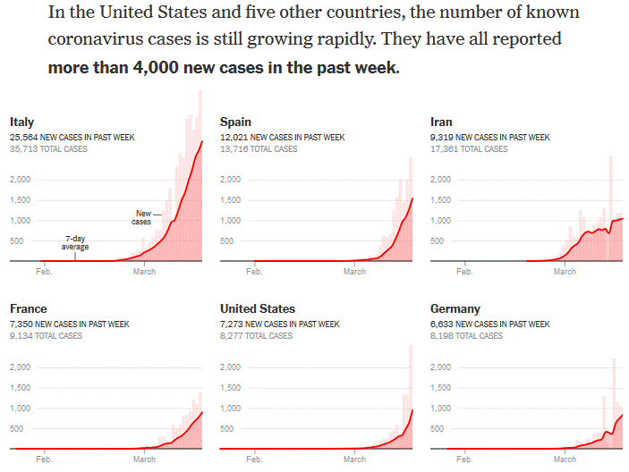
Countries with over 4000 new cases last week, facsimile of NYT March 19th 2020
Then they present six countries that “have had less severe outbreaks so far“. They are Switzerland, UK, Netherlands, Austria, Belgium and Norway. And again, the number of cases in the past week seem to be the only measure considered. This time it being above 1000, but of course less than 4000.
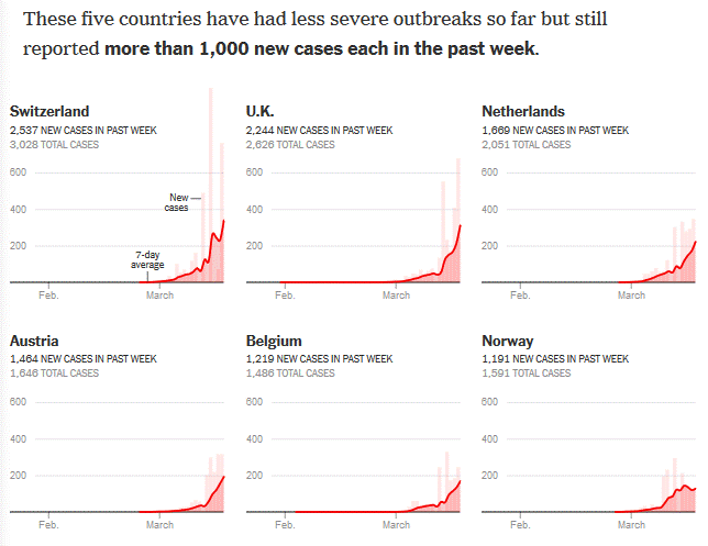
Countries with over 1000 new cases last week, facsimile of NYT March 19th 2020
Do you spot any differences between those two groups? Like perhaps how, the UK excluded, the second group has populations that are less than half of those for the first group? That can’t possibly have an influence on the number of cases, can it?
Comparing statistics between countries is, as mentioned in the initial warning, difficult, but as a minimum, you have to compare per capita numbers, or, you know, don’t write “these numbers are worse than these other numbers” when anyone with half a brain would know that your conclusion after learning the US had 7,273 new cases last week and Norway had 1,191, absolutely should not be “that looks very bad for the US“.
Here’s an overview for these six countries that includes rough population numbers from Wikipedia and a “per 1000 population” statistic helpfully colored for a useless statistic that you should use for nothing except to go “Wow! That’s a bad mistake in the New York Times!”
| Country | New cases | Population (in 1000s) |
New cases per 1000s pop |
|---|---|---|---|
| Italy | 25564 | 60317 | 0.42 |
| Spain | 12021 | 46733 | 0.26 |
| Iran | 9319 | 83184 | 0.11 |
| France | 7350 | 67022 | 0.11 |
| USA | 7273 | 328240 | 0.02 |
| Germany | 6633 | 83149 | 0.08 |
| Switzerland | 2537 | 8570 | 0.30 |
| UK | 2244 | 67546 | 0.03 |
| Netherlands | 1669 | 17425 | 0.10 |
| Austria | 1464 | 8903 | 0.16 |
| Belgium | 1219 | 11516 | 0.11 |
| Norway | 1191 | 5368 | 0.22 |
Data from NYT and Wikipedia. Table produced using formattable in R.
Again if you are now thinking the US and the UK are doing fine, read the first paragraph over and over until your eyes bleed. But do go away with a commitment never to accept comparisons data between countries that do not at least acknowledge that the per capita measure would tell a different story.
A jigsaw analogy for teaching
Have you ever observed and thought about the steps along the way as a child figures out how to do a jigsaw puzzle? They start out mostly just chewing on the pieces, but soon they develop a desire to get to the completed puzzle. Sometimes they need a little help. There’s a stage where they have mastered figuring out in what spot a piece belongs, but not the art of rotating it so the image, and more importantly the shape, fits.
Later comes more abstract wisdom, such as beginning with edges and/or easily identifiable parts of the image and looking for candidate pieces and checking each in turn. Along the way they may ask for help, or need help, but they also need to struggle and try for themselves. If we always lend them a hand when a piece doesn’t immediately slot into place we either slow down the progress of their learning and/or teach them the trick of getting us to do the puzzle for them. But if we never do they are unlikely to bother with puzzles at all.
I recently had the thought that acting as an instructor (a teacher, lecturer, tutor, etc.) could be modeled in many ways as helping a child who is figuring out how to solve a puzzle. There’s the need to give the student the right level of challenge and not start them out with a 500 piece puzzles of the Andromeda galaxy; the need to let them struggle at times; and the need to find the right level of intervention, a word of encouragement, a Socratic question, a suggestion, or even modelling the right approach.
The challenge is though that there is no physical puzzle to observe, no easily definable shared reality to work with. The completed parts of the puzzle are in the student’s brain and it takes time to understand what is there already, what pieces are missing here and there in the interior, and, even more important and time consuming, what shape the puzzle has at the edges.
And the puzzle piece you are trying to add isn’t physical either. Say it is teaching someone about adjectives. That seems straightforward, but how much a student is ready to learn will vary. Do they know anything about sentence analysis? What a subject and object is? And what is the goal? Pass the next test? Gain an understanding they can use to move on to the next piece of that puzzle?
The child cares about completing their puzzle and seeing the final picture. The student may not care about adding this puzzle piece to their, or about completing previous parts that you can tell are missing based on their misunderstandings and errors.
And beyond that it is not just about this one piece. Even more nebulous, but in the end more important, is teaching independence. The end goal, even though it may be years in the making, is for a student to be capable of progressing “on their own”, to analyze their own currently state of knowledge, to seek out resources at the right level to fit a new piece to their puzzle.
Is this a useful model? Maybe it is for some and not for others. And the lesson to take away might differ too. Some instructors need to let students struggle more, some need to get better at choosing the right level of challenge. And some need to nod in recognition when I sign off with: Sometimes you can only do so much with the time, energy, students and learning environment you are in.
